E-mail for SCC faculty and staff has been down since Friday afternoon. If you need to reach me, leave a comment on this post with your e-mail address, and I’ll get back to you a.s.a.p. Hopefully I.T. will have things fixed shortly. I’ll let you know when I can access my inbox again.
I already sent out an e-mail to this effect, but I want to double down on the info just make sure everyone gets the word.
In the happy glow of anticipation for the holiday weekend (and then in the subsequent glow of gorging myself on comfort food), I have decided not to require an additional assignment in ART104 for this week. Please make sure you finish your drapery study homework before our next class meeting on November 30 (details are here).
Looking for something fun to do tonight, Friday, November 18? Of course you are! So why not check out the anniversary party at Studio Luloo in Oaklyn, NJ! The bash starts at 7 pm, and Salem Community College CGA major extraodinaire Billy Bollinger will be playing with Podacter, his self-described “dum dum punk band” (way to sell yourself Billy).
If that’s not reason enough to bestir yourself (and why the heck wouldn’t it be?!?), all the money earned goes to wicked good causes.
In Billy’s words:
All proceeds from the door will be donated to Studio Luloo, keeping the space alive and able to continue being a cool spot for local bands and to benefit their awesome community outreach programs like COMMUNITY ROCKS!
On top of that, if you pick up a cd, cassette, or vinyl from my band, all money made at our table will be donated to the American Civil Liberties Union (ACLU.ORG) to help defend basic human rights. We will also have a donation jar conveniently placed out in case you really hate physical records.
YAY thanks for listening ya’ll and let’s smash fascists, racists, sexists, and homophobes together!
The Need to Know
The Location
Studio Luloo
215 W. Clinton Ave
Oaklyn, NJ 08107
The Amenities
Studio Luloo is BYOB for those who are of age and located directly next to “a pretty dank brewery, a pizza place, and a water ice place lovingly named Yum Yum’s.” (Billy’s words).
The Music Lineup
In addition to Podacter, the lineup (described oh-so-succinctly by our Mr. Bollinger) is as follows:
No Regrets (Ska Punks playing their first show in 5 years)
Sleep In. (twinkly, mathy smarty pants emo stuff!)
Brian Mietz (Weezer-esque funny songs from a good boy and fellow graphic designer)
This is such a great idea. It’s exciting to see people fighting the good fight. I so very very much want to go, but I have to work :(. You all need to attend and tell me about it so I can live vicariously! Go… change the world (and maybe enjoy a beverage and some music while you’re at it).
For this fine pre-Thanksgiving week, PartyPeople, we are going to anticipate those fancy tablecloths soon-to-be dribbled with cranberry blips and gravy bloops by practicing our wipe out drawing skills on a mini-still life of drapery (fabric). Did you know wipe outs are the gravy of charcoal drawing? Yup… they cover everything and are just a tad on the messy side. 😛
The goal of this assignment is to apply what you’ve learned about visual measuring PLUS what you’re currently practicing with value blocking to a more complex subject. Think of it as a benchmark for how well you’ve absorbed the learnin’ so far: like a take home test only more… dusty. By the way, it’s okay to be intimidated by drapery’s undulating forms, but remember it can still be broken down into simple masses and shapes just like everything else we’ve encountered in class.
Although I am assigning this homework now and strongly encourage you to do it this week so you don’t get overwhelmed next week when you get new content thrown your way, you will not turn it in until our next class meeting, which is Wednesday, November 23. No need to send me images unless you need help or feedback, both of which I happily offer. In the meantime, here are assignment details, some step-by-step and examples to help you succeed.
Da Basics
As stated above, you will be creating for this homework assignment a wipe-out still life of drapery.
D’oh!!
No, no, no… not that kind of wipe out! We’re talking about a drawing where you use erasers to wipe away areas of a preliminarily established value in order to render forms.
You Will Need…
A piece of white drawing paper at least 11″x 14″ in size.
Charcoal. You can use either vine charcoal or compressed charcoal for this assignment, but please start with vine and use compressed only as necessary to make the darkest marks (ie. towards the end).
D’oh!!!
Erasers. Kneaded (a.k.a. cat yack) erasers are designed to lift charcoal gently. White vinyl erasers, like the kind that come on the end of most mechanical pencils, can be used for more aggressive removal, but be careful not to tear your paper.
A piece of plain white or light colored cloth. A sheet, a tablecloth, a napkin, a towel, a t-shirt, your crazy Aunt Ida’s handkerchief… pretty much anything fabric-y will work as long as it’s in the 1–3ish value range and doesn’t have patterns or printing.
A lamp or other strong directional light source you can point at stuff.
How to Set Up the Still Life
Pin the cloth to a wall or drape it over something and arrange a few big, distinct folds. Three or four will do. You can get fancy if you want, but you’re learning, so I’d rather you demonstrate excellent technique on something simple than mediocre technique on something complex.
Point a light at the cloth from one direction to create strong shadows. Play around with what looks good to you, but make sure you get a deep range of lights and darks.
How to Prepare the Drawing Surface
Cover your drawing paper with a light gray in the 3 to 4 value range. You want it to be dark enough that you can easily see the marks you make with the eraser but not so dark you can’t erase at all. Use vine charcoal for this step, since compressed charcoal is more difficult to remove at any strength.
Blend the marks using your hand, a paper towel or toilet paper until you have an even all-over value.
Nothing says awesome like charcoal hands!
Drawing the Still Life
I may add some photos of these steps for you this weekend, but, for now, here’s a description of the need-to-do.
Look closely at the cloth to determine the basic shapes and proportions that compose it. These include the envelope, the overall shape of each fold, and the shapes of the highlights, form shadows and cast shadows.
Make faint guide marks on your paper either with an eraser or with vine charcoal in order to map out the basic layout. You don’t have to do a detailed contour since you are value blocking, but get an idea of where the cloth will sit on your paper (composition, baby!)
Use an eraser to wipe away the charcoal from any shape that is a 1 or a 2 on the value scale. These will include the form highlights on the drapery folds, which typically fall on the ridges (or sticky-out bits, as I’m sure they’re called in professional fabric circles). They may also include flat areas of cloth or parts of the background hit by the light. At this point you are looking for distinct shapes, positive and negative, rather smooth blends. I know it’s tempting to make it look all pretty-like from the start, but blending is an end game with both wipe out and value blocking. Because the focus is on shape, you should also avoid outlines. In fact… for this assignment, lines in general are a big no-no… as in just say no-no to defining form with them.
To avoid struggling with an eraser that behaves more like drawing tool than removal tool, clean it frequently by stretching (for kneeded) or rubbing on a rough piece of paper or cloth (for vinyl).
Use comparative measuring, plumb bobs and angles to ensure your shapes are in the correct place and are the correct.. well… shape. Try to see the form of the highlights you’re wiping out as every bit as distinct anything else. Divorcing yourself from the overall look of what you’re drawing and instead focusing on small areas of shape is the best way to tackle a complex subject without getting overwhelmed.
Work general to specific and all over the paper. Building the total composition helps you see value relative to its surroundings, which saves time and prevents many sobs of anguished frustration. With that in mind, cover the whole composition with either white erased areas (which represent values 1 and 2) OR reserved gray areas from your original toning of the paper (which stand in for values 3–10).
Step back, compare and evaluate. Measure and adjust the drawing as necessary.
Use your vine charcoal to refine and add shapes, separating darker grays (6-10) from light to mid grays. The dark grays will likely lay in the valleys and on the sides of the folds that face away from the light. They will also be in the cast shadows. Be aware that cast shadows for drapery are in multiple. In other words, not only is there a big one for the cloth overall, but each each individual fold tends to have its own cast shadow.
Add, you guessed it, yet another round of refined shapes separating out the darkest darks (8–10) from the mid darks.
You can continue adding refined shapes for as long as you like, though, once you get a fairly convincing range of values, refinement can happen more organically by removing or adding charcoal where needed. Some areas to pay particular attention to include reflected light in the form shadows and also the placement of the core shadows (the darkest part of the form shadow). Getting these correct adds mega-depth to the piece.
Hey, blend lovers, now is also the time when you can smooth out the transitions between different values. On a related note, did some outlines sneak into your drawing when you weren’t looking? Understandable… they are the sneaky sneaky ninjas of the art world! Fight their stealthy campaign to flatten all space! Erase or blend in all offenders. Shapes only welcome here!!!
You’ve been standing back and evaluating all along, right? Well do it one more time to make sure everything is working as desired. Turn your drawing upside down or look at it through your phone to get a fresh perspective.
Examples
Here are a few examples of charcoal drapery studies. They’re not all wipe out drawings, but they give you some benchmarks nonetheless. FYI: you do not need to set up compositions as complex as these. Again, three or four vertical folds in your cloth will do.
That’s all, folks!
Don’t forget to check back into the blog next Wednesday for the at-home assignment that will take the place of our usual in-person meeting.
Always remember and never forget that your second project in ART104: Drawing is due next Wednesday, November 16 at the beginning of class. We will have our critique first thing, so please come on time and prepared, especially since this assignment is worth a big ol’ 10% chunk of your grade. For more on Project 2’s nitty and gritty, please review the guidelines.
If you already read the guidelines (or listened in class) you know that this past Wednesday, November 9, there was a task due related to Project 2, namely submitting a photograph of your initial gray and white block in. Some of you were on it. Others… I don’t know…. Maybe you were so burned out by late-night election drama you forgot. Maybe you have a project-instruction-eating pet with a mission to foil on-time homework submission. Hey, stuff happens. Although you can’t get back the points already lost, you CAN send me a progress-shot-for-advice anytime between now and Wednesday. I’m here to help if you need it.
In that spirit, below is some more information on value-blocking to guide you. FYI: the photographic examples in the step-by-step are from a painting demo I did earlier this year, so it’s not exactly the same as charcoal drawing. However, the basics align.
Value Blocking Basics
What Is Value Blocking?
Value blocking is a method of working from general to specific to build the overall composition of an artwork using distinct shapes of light and dark.
Why Do We Want to Block Values?
Blocking in the overall value scheme is certainly not the only way to begin a two-dimensional artwork, but it’s pretty darn-tootin’ effective. Why? Because you are able to quickly see relationships between parts of your total drawing before you get locked in. Formal elements like value change relative to what’s around them. Example: a light gray looks lighter next to black than it does next to white. Don’t believe me? Check out the the crazy pic below. That really is the same gray in the dots!
Not only does value blocking help you see relative values, but, as stated, it’s a method of working general to specific, and that’s pretty much always a good thing in art. Considering the big picture before focusing on details saves you from the revisions, reworking and regret that often accompany trying to obsessively perfect things a section at a time. Nothing drives you to copious amounts of chocolate faster than realizing you drew the best eyeball in the history of ocular-themed artwork, but you have to get rid of it because you didn’t plan how it would work with the rest of your piece.
How Does Value Blocking Work?
The basic process of value blocking begins by considering your subject in terms of two values: white and a light/middle gray. If you are working from a source such as a still life, landscape, model or photograph, make the decision that every piece of light and shadow you see is either white or gray. If an area is bright, say values 1–3, leave it white. If it is darker, make it gray.
Note: it is absolutely, positively, stick-six-post-its-on-it crucial to see the light and dark areas you’re blocking as distinct shapes. The shadow under an eyebrow, for example, should be considered every bit as real and defined a shape as the eyebrow itself.
Once you have laid out your entire image in white and gray shapes, refine, refine and did I mention refine? Make a second pass adding a third value, usually a darker gray or black to separate values 8–10 from the mid-tones. Refine your shapes as you work. Depending on your project goals, you can then make additional passes, each time extending the range of values.
In Conclusion…
Because of its relative speed and its ability to help you break down complex forms into manageable shapes, value blocking is an incredibly powerful tool. In fact, I use it all the time, particularly for figure drawing, where capturing essence quickly is crucial.
For more information on the process, please check out the following video tutorial and the step-by-step below:
Step-by-Step Value Blocking for Project 2
Examine your chosen still life to determine the main masses of light and dark. Use your value scale to help, especially where color confuses the issue. Remember, one of the goals for Project 2 is to help you see the value underlying the colors, so give yourself some serious practice.
Block in any value that falls between 4–10 using a light middle gray. Remember as you draw to consider each value area as a distinct shape including form highlights and shadows. Double check measurements, angles, plumb bobs and negative shapes as you go, making any refinements that are necessary for a more accurate drawing.
Step back to compare your initial layer of value blocking to your still life. You can’t always see what’s what up close. Do the value shapes feel accurate? Don’t forget: squinting isn’t just for those of us who forgot our glasses anymore; it can help you see value more easily. Add grays and/or erase back to whites to refine your shapes.
Block in the darkest values (8–10) with a darker gray. Refine your shapes as you go.
Step back again to compare.
Blend in the full range of values using your charcoal to add or darken and your eraser to remove or lighten. Don’t forget to refine, refine, refine!
Conclude with a good long step back and compare. Turn your drawing upside down or look at it through your phone to make it easier to see if you got things right.
That’s all folks!
P.S. If you voted, bring proof in the form of your voter registration card, “I Voted” sticker, photos from the polls, etc. That’s assuming you want the offered extra credit…
Questions? Comment or e-mail!
Working general to specific is pretty much always a good thing in art… a great thing, actually. Considering the big picture before focusing on details typically leads to more successful compositions, and… BONUS… it saves you from the revisions, reworking and regret that often accompany trying to obsessively perfect things a section at a time. Trust me, nothing drives you to copious amounts of chocolate faster than realizing you painted the best eyeball in the history of occular-themed artwork, but you have to get rid of it because you didn’t plan how it would work with the rest of your piece.
How Does Value Blocking Work?
The basic process of value blocking begins by considering your subject in terms of two values: white and a light to middle gray. If you are working from a source such as a still life, landscape, model or photograph, make the decision that every piece of light and shadow you see is either white or gray. If an area is bright, say values 1–3, leave it white. If it is darker, make it gray. It is absolutely, positively, stick-six-post-its-on-it crucial to see the light and dark areas you’re blocking as distinct shapes. The shadow under an eyebrow, for example, should be considered every bit as real and defined a shape as the eyebrow itself.
Once you have laid out your entire image in white and gray shapes, refine, refine and did I mention refine? Make a second pass adding a third value, usually a darker gray or black to separate values 8–10 from the mid-tones. Refine your shapes as you work. Depending on your project goals, you can then make additional passes, each time extending the range of values.
In Conclusion…
Because of its relative speed and its ability to help you break down complex forms into manageable shapes, value blocking is an incredibly powerful tool. In fact, I use it all the time, particularly for figure drawing, where capturing essence quickly is crucial.
For more information on the process, please check out the following video tutorial:
Extra, extra, extra credit for students in Del’s fall 2016 classes!
Happy Friday, my intrepid Drawing, Printmaking and Web Design students! It may be fall break, but there’s never a wrong time to introduce a shiny new extra credit opportunity!
As you may or may not know, Salem Community College has an online literary and art magazine called From the Oak Desk. It is published monthly and features the work of current students. Supercool… check it out.
Anyhoo… I will award 10 extra credit points to anyone who, between now December 15th, submits a piece representing the work they’re doing in my class(es). In other words, printmaking students should submit a print from class, Drawing students should submit a drawing from class and web designers should submit a mock up or website from class. The submission process for From the Oak Desk is as easy as snapping a photo and sending an e-mail.
Nitty Gritty Oh-So-Pretty Step-by-Step on How to Get the Extra Credit:
Do this not later than the magazine’s December deadline, which is the 15th.
Forward me a copy of your sent submission e-mail with timestamp and attachment(s) in place.
Profit.
Actual fries I got from a Middle Eastern restaurant just down the street from me in Philly. Hand cut with grilled peppers and onions… if that doesn’t make you want to be an engaged, exhibiting artist, I don’t know what will!
Go for french fries (which always sound amazing after being all productive and crap).
Profit more because french fries.
FYI: this is a one-time only offer, meaning you can only get points once. Don’t spam Professors Lucente and Martin with a new e-mail every time you make an art. Rather, choose wisely. The caveat is that, if you have more than one class with me, you may receive extra credit in all of the above if you submit appropriate pieces for each. These multiple submissions can be sent to the From the Oak Desk jury in one e-mail.
Huh… well, it was… something. The rough and divisive nature of both the campaign and the election has certainly produced strong emotions in people on both sides of this aisle. As you are no doubt aware, protests are happening nationwide. There is a lot of uncertainty floating around about what happens next. Heck, reading the comment section on any given political article or Facebook post is like staring into the time vortex (don’t do it; you’ll go insane).
If you feel anxious, are being bullied or simply want to vent some feelings because of this turbulent transition, I am willing to listen. I am in no way a trained counselor, but sometimes talking helps. Outside of that, make sure you are engaging with friends, family and others who will give you support. For more serious discussion, you may wish to contact Salem Community College for information about what counseling resources exist in the area.
Don’t forget to vote! I dragged my lazy tush out of the snuggly bed at 6:45 a.m. in order to cast my choices for a less apocalyptic future. Your turn!
FYI: lines may be long. As the woman in front of me commented, “Whatever people are feeling, they’re feeling it strongly!” Leave yourself a little extra time and bring a distraction. It’s so very worth it (and not just for the extra credit).
Just as with Project 1, you are responsible for knowing and understanding all the project requirements, so put those literate eyeballs to good use!
Project 2 Step 1
As you know if you did the aforementioned reading, Project 2 requires you to select a master work of art to use as a basis for creating a full value drawing. Below are nine thumbnail images of the possibilities from which you can choose. Clicky click any of them for a bigger view. You need to let me know your selection on Wednesday, October 26 during class.
The Candidates
Still Life with Herrings by Chardin
Still Life with a Skull by Champaigne
Still Life with Salt Tub by Claesz
Still Life with Pitcher by Picasso
Still Life with Fish by Manet
Basket of Fruit by Caravaggio
Basket of Plums by Chardin
Goldfinch by Fabritius
Still Life with Pitcher and Fruit by Cezanne
Tips on Choosing a Still Life
Plunged as you are in the midst of full-on busy semester, it’s tempting to just pick the thing that looks easiest and go with it. I suggest, however, that you take time to really consider what you’re most interested in trying and learning from. Consider the composition and subject and also squint to see the underlying value scheme. FYI: artworks that seem simple on the surface, can actually be surprisingly difficult due to subtle use of darks and lights.
And, as it says in the project guidelines, don’t be afraid to declare, “Challenge Accepted!” Pushing limits is how we go from meh to AWESOME.
Happy Friday, my effervescent drawing students! As you know, we are entering the wonderful world of value in ART104. Hooray!
If anyone is interested, here is the presentation (in PDF format) that I gave on Wednesday, October 19 on the formal element of value: The Value of Value
Annddd… below is your friendly neighborhood reminder of what you need to complete and bring to our next class.
Finish Your Value Scale!
If you didn’t get it done in class, complete your value scale of ten 1″ x 3″ bars representing a range from 1 (white) to 10 (black) . Render this in conté crayon (what some of you know as “Blick sticks”). You can also use a kneaded eraser to knock back values if they get a little too dark. Be as neat as possible and create an even progression so that your scale can be effectively used as a guide. The final product should look something like this:
Draw a Sphere!
Draw it from your imagination but shade realistically in a full range of values using conté crayon or vine charcoal. You may work in your creativity journal or on a separate piece of paper. For the purposes of this exercise, assume you are rendering a white sphere on a white surface.
Ideally, rendering the sphere is no problem, because you paid attention during the demo and maybe even took some of those helpful things… what are they called? Oh yeah… notes.
In case you were just too burned out after critique to register what we covered, however, here is a step-by-step demo to ensure everyone is on the same page with regard to this important process.
Using Value to Build the Form of an Imagined Sphere
Sketch the box in which your sphere will sit and lightly inscribe a circle within it. It can sometimes help to knock the corners off the box and then refine the resulting octogon into a circle (see image under Step 2).
Indicate the direction of your light source. I did my demo with a imagined light above and to the left at about a 45° angle.
When it’s lit by a single light source, a sphere will have a dark side and a light side (just like the moon). Sketch a light line perpendicular to the direction of the light to indicate the separation between the two sides (see image under step 2). Some artists call this the terminator, not because it looks like evil robot Arnold Schwarzenegger, but because it marks an ending to the light (which I guess IS kind of the same as evil robot Arnold Schwarzenegger).
The direction of the light will also affect the placement and shape of the cast shadow. The cast shadow is on the surface on which sphere rests and is caused by the sphere blocking light. One way to estimate how far this shadow extends is to draw lines parallel to the direction of the light, intersecting with the ends of the terminator on down to the resting surface (see image under Step 2).
Refine the terminator into an ellipse by marking the poles: the points where the terminator crosses the edge of the circle. If we imagine the terminator ellipse as being inside a box—which of course is how we’ve drawn ellipses so far—the poles are equivalent to two midpoints. The belly of the ellipse for this particular sphere rounds down into the shadow side. It looks similar to a rubber band around a ball.
Fill in a dark middle value to define the form shadow—the shadow on the object—as well as the cast shadow. Both shadows should be around a 6 or 7 according to your value scale.
There are two main values in the light half of the sphere. FIRST is the highlight, which represents the point where the light source strikes and is the brightest area in the drawing. SECOND is the light middle tone, which for this particular imaginary sphere will probably average around a 3 on your value scale. Roughly block these two values into your sphere.
There are three main values in the form shadow.. FIRST is the shadow edge or core shadow, which is usually next to the terminator. The core shadow is the darkest apparent value on the sphere and will probably be in the 8–9 range. SECOND is a dark middle tone (the 7ish value you blocked in Step 6) which composes most of the rest of the form shadow. THIRD is the area of reflected light, which is bounced back from the resting surface and hits the sphere on or near the edge opposite the light source. Since our surface is white, this reflection will be lighter than the surrounding shadows. REMEMBER: all values on the light side will be lighter than any value on the dark side. The human eye can play tricks, making you think that the reflected light, for example, is as light as the light side values. However, it’s not true for examples like ours with a single light source.
Block in the the cast shadow, which will also have three parts. FIRST: directly under the sphere and will be a 9 or even a 10. SECOND: the shadow will fade to something akin to the dark middle tone of our form shadow (7ish). THIRD: toward the edge of the cast shadow, the value will be a light dark tone in the range of a 5 or 6.
Refine your range of values, erasing, blending and adding darkness where necessary so you get a gradual fade. If you like, add a mid value in the background to set off the sphere and make it feel more like a real object sitting in space.
Do the Handout!
Of course, smooth shading isn’t the only way to establish value. You can also use repeated lines or dots to simulate a full range. This method relies on visual blending, which is what happens when your eyes automatically average closely placed blacks and whites so they appear gray.
To practice creating value with lines and dots, complete the worksheet you were given in class. Read the brief description of each technique, and then shade the circles accordingly. Your goal is to recreate the light and shadow the example sphere. FYI: you will have an easier time doing this worksheet if you have already done a blended sphere.
And finally…
Don’t don’t DON’T forget… in addition to homework, your creativity journals are due for midterm review next class. Make sure you pack yours so you can get credit for your work so far!
Please also bring back any conté crayons, charcoal or erasers you borrowed to do your homework.


 Some of you were on it. Others… I don’t know…. Maybe you were so burned out by late-night election drama you forgot. Maybe you have a project-instruction-eating pet with a mission to foil on-time homework submission. Hey, stuff happens. Although you can’t get back the points already lost, you CAN send me a progress-shot-for-advice anytime between now and Wednesday. I’m here to help if you need it.
 Considering the big picture before focusing on details saves you from the revisions, reworking and regret that often accompany trying to obsessively perfect things a section at a time. Nothing drives you to copious amounts of chocolate faster than realizing you drew the best eyeball in the history of ocular-themed artwork, but you have to get rid of it because you didn’t plan how it would work with the rest of your piece.
 Note: it is absolutely, positively, stick-six-post-its-on-it crucial to see the light and dark areas you’re blocking as distinct shapes. The shadow under an eyebrow, for example, should be considered every bit as real and defined a shape as the eyebrow itself.


 that often accompany trying to obsessively perfect things a section at a time. Trust me, nothing drives you to copious amounts of chocolate faster than realizing you painted the best eyeball in the history of occular-themed artwork, but you have to get rid of it because you didn’t plan how it would work with the rest of your piece.
 see the light and dark areas you’re blocking as distinct shapes. The shadow under an eyebrow, for example, should be considered every bit as real and defined a shape as the eyebrow itself.


 Finish Your Value Scale!


 When it’s lit by a single light source, a sphere will have a dark side and a light side (just like the moon). Sketch a light line perpendicular to the direction of the light to indicate the separation between the two sides (see image under step 2). Some artists call this the terminator, not because it looks like evil robot Arnold Schwarzenegger, but because it marks an ending to the light (which I guess IS kind of the same as evil robot Arnold Schwarzenegger).
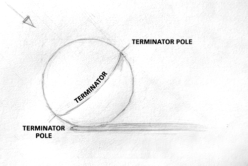


You must be logged in to post a comment.